基本布局
Container
Container 可以设置固定的宽高属性,没有其他参数设置时,Container将会根据子控件自行调整大小:
Container(
    color: Colors.blue,
    height: 200,
    width: 200,
)其次,还可以通过constraints属性设置最大/小宽、高来确定大小,constraints 如果不设置,默认最小宽高是0,最大宽高是无限大(double.infinity):
Container(
    color: Colors.blue,
    child: Text('Flutter container Demo'),
    alignment: Alignment.center,
    constraints: BoxConstraints.tightForFinite(
        width: 200
    ),
)
注意:设置对齐方式后,Container 将会充满其父控件,相当于 Android 中 match_parent,不在是根据子控件调整大小
通过 transform 可以旋转、平移、缩放Container:
Container(
    child: Text("旋转"),
    width: 200,
    transform: Matrix4.rotationZ(0.707),
    height: 200,
    color: Colors.pink,
)
Flexible、Expanded和 Spacer 都是具有权重属性的组件,可以控制 Row、Column、Flex 的子控件如何布局的控件。
Flexible
Flexible组件可以使Row、Column、Flex等子组件在主轴方向有填充可用空间的能力(例如,Row在水平方向,Column在垂直方向),但是它与 Expanded 组件不同,它不强制子组件填充可用空间。
构造函数:
class Flexible extends ParentDataWidget<Flex> {
  /// Creates a widget that controls how a child of a [Row], [Column], or [Flex]
  /// flexes.
  const Flexible({
    Key key,
    this.flex: 1,
    this.fit: FlexFit.loose,
    @required Widget child,
  }) : super(key: key, child: child);
 //……
}
Flexible 中flex参数表示子控件的占比,fit参数表示填满剩余空间的方式,说明如下:
- tight:必须(强制)填满剩余空间。
- loose:尽可能大的填满剩余空间,但是可以不填满。
比如,Column 中有 4 个子控件,上下的固定宽,中间的占满剩余的空间,且按比例分布,代码如下:
Column(
    children: [
        Container(
            height: 200,
            color: Colors.pink,
        ),
        Flexible(
            flex: 2,
            child: Container(
                color: Colors.blue,
            )),
        Flexible(
            flex: 1,
            child: Container(
                color: Colors.yellow,
            )),
        Container(
            height: 200,
            color: Colors.pink,
        )
    ],
)
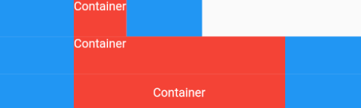
对于 fit 参数是针对于 类似 Container 的这样的组件而言的,Container 默认是适配子控件大小的,但当设置对齐方式时 Container 将会填满父控件,因此是否填满剩余空间取决于子控件是否需要填满父控件。
也就是在,没有设置对其方式时,可以通过 fit 参数的 tight 强制使其填满父布局的大小,看下面三个例子即可:
Row(
    children: <Widget>[
        Container(color: Colors.blue,height: 50,width: 100,),
        Flexible(
            child: Container(color: Colors.red,height: 50,
                child: Text('Container',style: TextStyle(color: Colors.white),),
            )
        ),
        Container(color: Colors.blue,height: 50,width: 100,),
    ],
),
Row(
    children: <Widget>[
        Container(color: Colors.blue,height: 50,width: 100,),
        Flexible(
            /// tight 模式强制填满父布局
            fit: FlexFit.tight,
            child: Container(
                color: Colors.red,
                height: 50,
                child: Text('Container',style: TextStyle(color: Colors.white),),
            )
        ),
        Container(color: Colors.blue,height: 50,width: 100,),
    ],
),
Row(
    Container(color: Colors.blue,height: 50,width: 100,),
        Flexible(
            child: Container(
                color: Colors.red,
                height: 50,
                /// 设置对齐方式,填满父布局
                alignment: Alignment.center,
                child: Text('Container',style: TextStyle(color: Colors.white),),
            )
        ),
        Container(color: Colors.blue,height: 50,width: 100,),
    ],
),
Expanded
Expanded继承字Flexible,fit参数固定为FlexFit.tight,也就是说Expanded必须(强制)填满剩余空间。
构造方法:
class Expanded extends Flexible {
  /// Creates a widget that expands a child of a [Row], [Column], or [Flex]
  /// expand to fill the available space in the main axis.
  const Expanded({
    Key key,
    int flex: 1,
    @required Widget child,
  }) : super(key: key, flex: flex, fit: FlexFit.tight, child: child);
}
Spacer
其源代码:
class Spacer extends StatelessWidget {
  const Spacer({Key key, this.flex = 1})
    : assert(flex != null),
      assert(flex > 0),
      super(key: key);

  final int flex;

  @override
  Widget build(BuildContext context) {
    return Expanded(
      flex: flex,
      child: const SizedBox.shrink(),
    );
  }
}
Spacer 的通过 Expanded 的实现的,和 Expanded 的区别是:Expanded可以设置子控件,而 Spacer 的子控件尺寸是0,因此 Spacer 适用于撑开Row、Column、Flex的子控件的空隙,可以将剩余的空间按比例划分,用法如下:
Row(
  children: <Widget>[
    Container(width: 100,height: 50,color: Colors.green,),
    Spacer(flex: 2,),
    Container(width: 100,height: 50,color: Colors.blue,),
    Spacer(),
    Container(width: 100,height: 50,color: Colors.red,),
  ],
)
层叠布局
Stack
Stack组件可以将子组件叠加显示,对于子控件的顺序,则是第一个被绘制在最底端,后面的依次在上一个控件的上面,如果想调整显示的顺序,则可以通过摆放子控件的顺序来进行。
Stack({
  this.alignment = AlignmentDirectional.topStart,	/// 对齐方式,默认是左上角(topStart)
  this.textDirection,								/// 文本的方向,绝大部分不需要处理
  this.fit = StackFit.loose,						/// 定义如何设非定位组件尺寸,默认为loose
  this.overflow = Overflow.clip,					/// overflow:超过的部分是否裁剪掉
  List<Widget> children = const <Widget>[],
})Stack未定位的子组件大小由fit参数决定,默认值是StackFit.loose,表示子组件自己决定,StackFit.expand表示尽可能的大,是否定位取决于是否为Positioned子组件:
- Positioned的子组件,它们的位置会根据所设置的top、bottom、right以及left属性来确定,这几个值都是相对于Stack的左上角;
- 对于非Positioned的子组件,它们会根据Stack的 aligment 来设置位置。
示例代码:
Stack(
    children: <Widget>[
        Container(
            height: 200,
            width: 200,
            color: Colors.red,
        ),
        Container(
            height: 170,
            width: 170,
            color: Colors.blue,
        ),
        Container(
            height: 140,
            width: 140,
            color: Colors.yellow,
        )
    ],
)
IndexedStack
IndexedStack是Stack的子类,Stack是将所有的子组件叠加显示,而 IndexedStack 只显示 index 指定的子组件,即第第 index 个子组件。
定位和对齐
Align & Center
创建一个位置对齐的组件,默认对齐方式居中[
Alignment.center]。
const Align({
    Key key,
    this.alignment = Alignment.center,
    this.widthFactor,
    this.heightFactor,
    Widget child,
})alignment:传入一个 AlignmentGeometry 对象,其为抽象类,子类有 Alignment 和 AlignmentDirectional,以及Alignment的子类 FractionalOffset;widthFactor&heightFactor:非空则将 Align 的宽度 / 高度设置为该因子的倍乘。
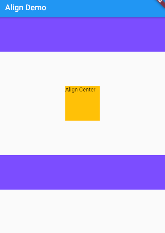
代码示例
Scaffold(
      appBar: AppBar(title: Text('Align Demo'),),
      body:Column(
        children: [
          Container(
            color: Colors.deepPurpleAccent,
            height: 100,
          ),
          Align(
            widthFactor: 3,
            heightFactor: 3,
            alignment: Alignment.center,
            child: Container(
              height: 100,
              width: 100,
              color: Colors.amber,
              child: Text("Align Center"),
            ),
          ),
          Container(
            color: Colors.deepPurpleAccent,
            height: 100,
          ),
        ],
      ),
    );
Center 控件继承自 Align,默认子组件居中:
class Center extends Align {
    /// Creates a widget that centers its child.
    const Center({ Key key, double widthFactor, double heightFactor, Widget child })
        : super(key: key, widthFactor: widthFactor, heightFactor: heightFactor, child: child);
}